Library symbols have properties to control they way they change size or color and the way they display text.
You can change the properties (but not the image) of an existing symbol. To do this, either double-click on the drawing's button in the library window, or select the button and then select the Edit Symbol command in the Libraries menu. This presents the Edit Symbol Dialog.
You can use this to change both existing symbols and new symbols that you are adding to a library.
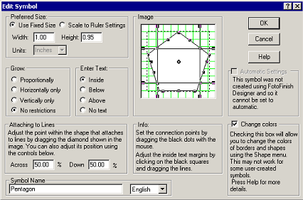
The Edit Symbol Dialog
Automatic Settings
If Automatic Settings is checked, the symbol was originally created with Designer and automatically has the properties of a native FotoFinish Designer object and you cannot override these using this dialog.
Preferred Size
The width and height fields control the size of the symbol when it is created using Drag and Drop. If the Grow setting is set to Proportional, changing one value changes the other, so as to maintain the same proportions.
This setting is grayed out for automatic symbols composed of more than one native object, since their original size is maintained.
There are two ways to set the preferred size for a symbol: Use Fixed Size and Scale to Ruler Settings.
If Use Fixed Size is selected, the shape is sized to exactly the width and the height specified on the screen, regardless of the rulers’ settings for the drawing. Your control panel sets the units of this measurement. If your system is set to use metric units the dimensions are in cm, otherwise they are in inches.
If Scale to Ruler Settings is selected, the symbol will scale to the size dictated by the ruler settings of the drawing. For example, if you set the preferred size for the symbol to be 1.0 meter, and you add the symbol to a drawing with a ruler scale of 1.0 meter to the inch, the symbol will be drawing exactly 1.0 inches long on the screen. However, if you add the symbol to another drawing with a scale of 0.1 meters to the inch, the shape will be drawn 10 inches long.
Grow
The four radio buttons control the way the symbols can be resized. These settings are grayed out for automatic symbols.
Proportional drawings have only four grow handles (one at each corner) and maintain their proportions when re-sized.
Horizontal Only drawings have only two grow handles and can be re-sized only in the horizontal direction. This is good for drawings that represent horizontal lines.
Vertical Only drawings have only two grow handles and can be re-sized only in the vertical direction. This is good for drawings that represent vertical lines.
No restrictions allow drawings to grow in all directions without maintaining proportions. These drawings have the usual 8 grow handles.
These values can be changed for symbols already added to a drawing using the Shape Sizing command.
Image Window
The image window shows the symbol image against a grid of green lines. A dotted border shows the edges of the rectangle that encloses the symbol.
A non-automatic symbol has 16 Connection Points shown as solid black circles. These are the points at which lines and other shapes will link to this drawing. Automatic symbols use the connection points of their native objects.
Shapes that can be linked to lines also show a hollow black diamond representing the attachment point.
Clicking on the circles and dragging with the mouse button held down moves them. The connection points should be arranged on the borders of the symbol. To be active, connection points must lie outside the margin lines (whether text is entered Inside the Drawing or not).
You can finely adjust the position of connection points using the F5, F6, F7 and F8 keys. The point you last clicked on, moves left, right, up or down by 1 pixel when these keys are typed.
When the text setting is Inside the Drawing, four margin lines appear. Clicking on the square handles at each end and dragging can move these. By default, these are set to create the smallest text entry area possible between all four lines. This should be expanded to allow the largest area that still forces all text to lie within the borders of the shape. When text is entered Above or Below the drawing, the margin lines are ignored.
Colors
Checking this box allows FotoFinish Designer to change the color of the fills, lines, border and text that show in non-automatic symbols. The style and thickness of borders and lines can also be changed. These settings are controlled by the Shape menu, not the Line or Text menu.
The color of the text, lines and borders follows the Border Color setting. The fills follow the Fill Color. Transparent fills are not affected by the fill color.
If this box is not checked, the drawing behaves like an imported image. Applying a border style places a border around the symbol but does not change the content of the symbol itself.
The substitution of colors for lines, fills etc. may not work for all symbols. If the image contains bit mapped images these may be unaffected by checking the color box. The rules are: All pens used follow the border style and color. Black fills follow the border color. Text color follows the border color. Non-black fills follow the Fill color. Transparent fills used by the drawing are left alone.
If you check this box you should experiment with a copy of the symbol to see the effects of color changes. If these are not satisfactory, return to the dialog and un-check the box again.
The colors and other properties of automatic symbols can always be changed. Remember that checking this box causes a copy of the symbol to adopt the current default color scheme when added to a drawing.
Symbol Name
You can assign each symbol in a library an optional name using the Symbol Name field. This is the name that shows in the ToolTip when the cursor is moved over the symbol in the library window.
It is also the name that is displayed on the button if you choose the Names command from the Libraries menu.